Visualizing Migration Stories

Image credit: Alberto Meouchi
On July 27, 2020, 51 people migrating to the United States were found dead in an overheated trailer near the Mexican border. Understanding why migrants willingly take such risks is the topic of a recent exhibition and report, co-authored by researchers at MIT’s Civic Data Design Lab (CDDL). The research has been used by the U.S. Senate and the United Nations to develop new policies to address the challenges, dangers, and opportunities presented by migration in the Americas.
To illustrate these motivations and risks, researchers at CDDL have designed an exhibition featuring digital and physical visualizations that encourage visitors to engage with migrants’ experiences more fully. “Distance Unknown” made its debut at the United Nations World Food Program (WFP) executive board meeting in Rome earlier this summer, with plans for additional exhibition stops over the next year.
The exhibition is inspired by the 2021 report about migration, co-authored by CDDL, that highlighted economic distress as the main factor pushing migrants from Central America to the United States. The report’s findings were cited in a January 2022 letter from 35 U.S. senators to Homeland Security Secretary Alejandro Mayorkas and Secretary of State Antony Blinken (who leads the Biden administration’s migration task force) that advocated for addressing humanitarian needs in Central America. In June, the United States joined 20 countries in issuing the Los Angeles Declaration on Migration and Protection, which proposed expanded legal avenues to migration.
“This exhibition takes a unique approach to visualizing migration stories by humanizing the data. Visitors to the exhibition can see the data in aggregate, but then they can dive deeper and learn migrants’ individual motivations,” says Sarah Williams, associate professor of technology and urban planning, director of the Civic Data Design Lab and the Norman B. Leventhal Center for Advanced Urbanism, and the lead designer of the exhibition.
The data for the exhibition were taken from a survey of over 5,000 people in El Salvador, Guatemala, and Honduras conducted by the WFP and analyzed in the subsequent report. The report showed that approximately 43 percent of people surveyed in 2021 were considering migrating in the prior year, compared to 8 percent in 2019 — a change that comes after nearly two years of impacts from a global pandemic and as food insecurity dramatically increased in that region. Survey respondents cited low wages, unemployment, and minimal income levels as factors increasing their desire to migrate — ahead of reasons such as violence or natural disasters.
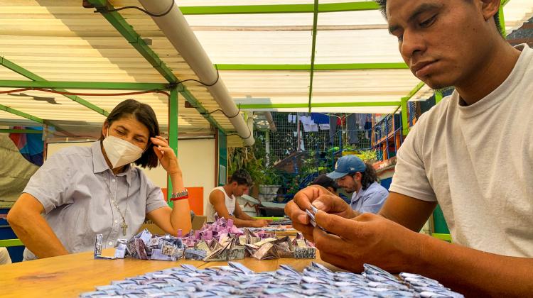
On the wall of the exhibition is a vibrant tapestry made of paper currency woven by 13 Latin American immigrants. Approximately 15-by-8 feet, this physical data visualization explains the root causes of migration from Central America documented by CDDL research. Each bill in the tapestry represents one migrant; visitors are invited to take a piece of the tapestry and scan it at a touch-screen station, where the story of that migrant appears. This allows visitors to dive deeper into the causes of migration by learning more about why an individual migrant family in the study left home, their household circumstances, and their personal stories.
Another feature of the exhibition is an interactive map that allows visitors to explore the journeys and barriers that migrants face along the way. Created from a unique dataset collected by researchers from internet hotspots along the migration trail, the data showed that migrants from 43 countries (some as distant as China and Afghanistan) used this Latin American trail. The map highlights the Darien Gap region of Central America, one of the most dangerous and costly migration routes. The area is remote, without roads, and consists of swamps and dense jungle.

The “Distance Unknown” exhibition represented data taken from internet hotspots on the migration pathway from the Darien Gap in Colombia to the Mexican border. This image shows migrant routes from 43 countries. Image courtesy of the Civic Data Design Lab.
The intense multimedia exhibition demonstrates the approach that Williams takes with her research. “One of the exciting features of the exhibition is that it shows that artistic forms of data visualization start new conversations, which create the dialogue necessary for policy change. We couldn't be more thrilled with the way the exhibition helped influence the hearts and minds of people who have the political will to impact policy,” says Williams.
In his opening remarks to the exhibition, David Beasley, executive director of WFP, explained that “when people have to migrate because they have no choice, it creates political problems on all sides,” and emphasized the importance of proposing solutions. Citing the 2021 report, Beasley noted that migrants from El Salvador, Guatemala, and Honduras collectively spent $2.2 billion to migrate to the United States in 2021, which is comparable to what their respective governments spend on primary education.
The WFP hopes to bring the exhibition to other locations, including Washington, Geneva, New York, Madrid, Buenos Aires, and Panama.


